Voodle
Four design sprints
Ongoing user research
Design lead
UX research
Prototyping
iF project team
Voodle product team
Voodle engaged iF to overcome adoption challenges on their short-form video platform. We delivered an outcome that set Voodle up for strategic next steps.
I led our team through research-based design sprints. We identified three insights that were key to adoption and motivation.
We re-imagined Voodle's onboarding flow , designed a new prompt feature , and updated the UI to incentivize responses .
Several months into its public launch, Voodle wasn't attracting consistent usage. Targeted ads successfully led to downloads, but users would stop engaging before creating content or connecting with teammates. Or, working teams invited to the platform by their leadership would send one or two videos – but ultimately stop engaging after their first session. Voodle came to iF with a twofold challenge:
|
|
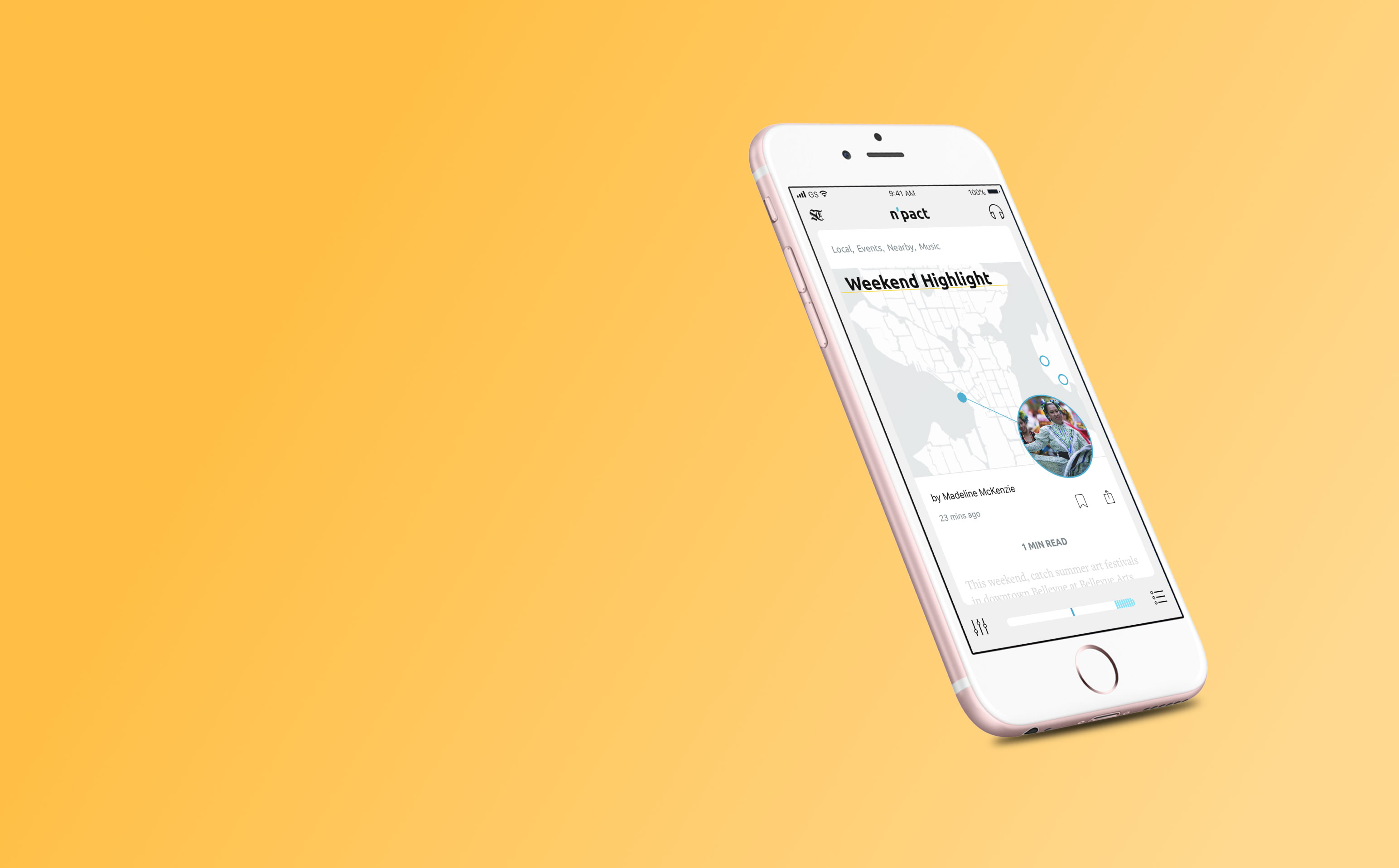
I led the design process that helped Voodle transition to a more organized browse experience with clearer calls-to-action, conversation topics, and response flows.
“ |
iF propelled the overall design of our product with thorough research, actionable insights, and valuable designs. After this process, we have a much better understanding of how users interact with our platform. |
—Forest Key, CEO Voodle Inc |
I handed off modular designs with room for variation: Quick updates for immediate implementation, and larger, more structural ideas for future consideration.
“ |
The iF team was flexible during the entire project and worked with us to adapt the scope as we learned from the process. We benefited from the agility of the team and the dynamic workflow as they worked to understand our needs. |
—-Beverly Vessella, Director of Product, Voodle Inc. |
In one activity, teammates worked together to plot possible use-cases across two different axes.
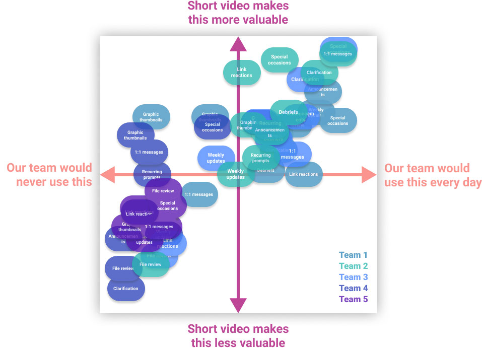
Activities were conducted through a combination of increasingly high-fidelity interactive prototypes and the Voodle app itself. In some cases, we used smoke-and-mirrors Wizard of Oz techniques to gather quick feedback on features that were otherwise time-consuming to build.
Here's a sample of feedback from Sprint 2 testing. I identified key quotes from user testing and mapped them over our prototype flows, to facilitate strategic conversations with our clients.
iF's final design work for Voodle revolved around three key insights. These insights recommended how Voodle could best entice users to explore their platform, invite teammates, and energize ongoing conversations.
|
|
Moments of fun, spontaneous connection are most likely to inspire and support adoption.Throughout our research, participants got most excited about Voodle's potential for their team after learning new things about colleagues, or seeing the people they worked with in new ways. |
|
|
|
|
|
Focus on unblocking potential power-users, rather than ensuring full-team adoption.It only takes one or two enthusiastic teammates to discover an app like Voodle and start sharing infectious content. Just the experience of seeing teammate's voodles can inspire people initially uncomfortable with recording videos. |
|
|
|
|
|
While short video creates a captivating "watch" experience, it's difficult for users to know when or how to respond.Moving from passive video watching to active video creation is a big context switch. When a platform wants to encourage immedaite, spontaneous responses, its users need clear interface cues and zero blockers to make the transition. |
|
|
|
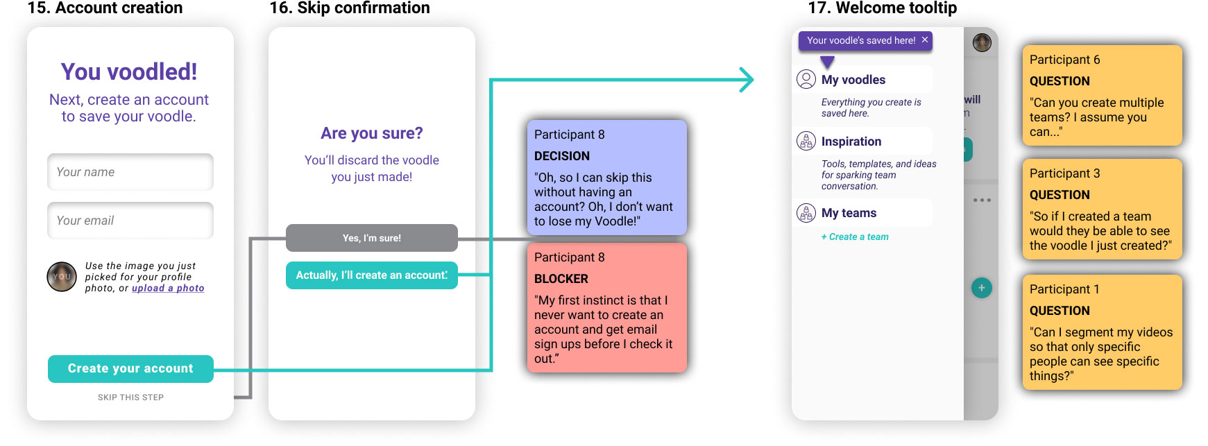
I also recommended that we move account creation back in the flow, letting users record a voodle before asking for their emails (Screen 1). While the Voodle team liked this as a future idea, they requested keeping account creation first for our handoff.

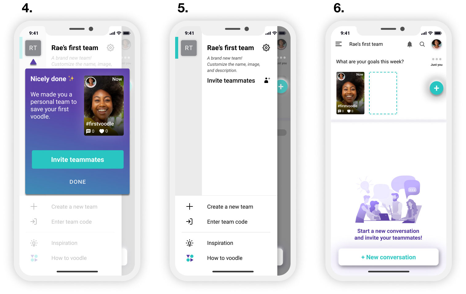
In every testing session users immediately looked for a path to their new content immediately after creating their first voodle. We wanted to insert more onboarding guidance at this point. But testers consistently skipped, dismissed, or ignored our pop-up mmessages as they rushed to try features for themselves.
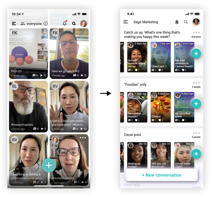
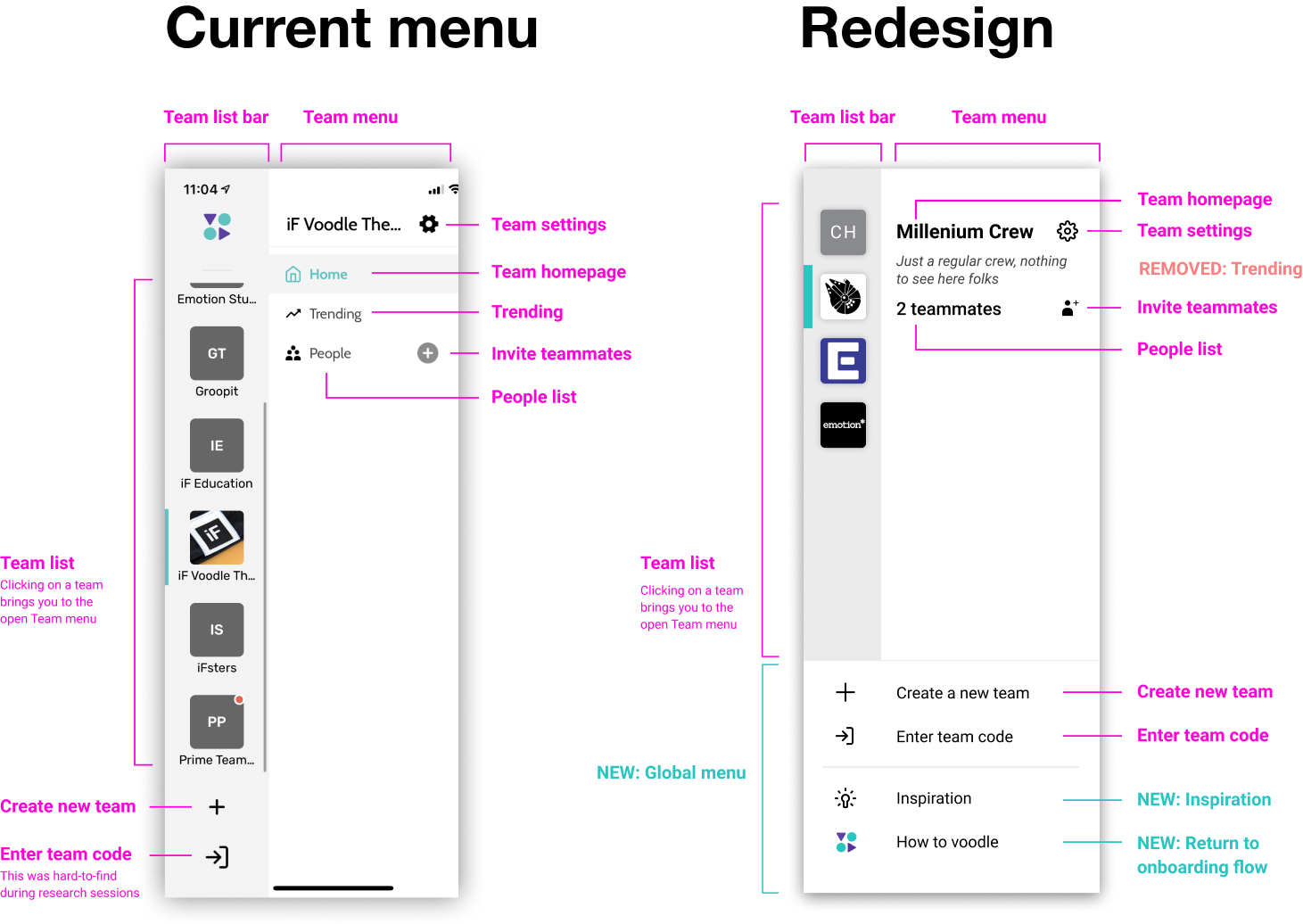
My solve was to embed further onboarding guidance into the interface itself, next to the parts of the UI that users were most likely to tap. Instructions on team customization lived directly on the menu until users interacted with the feature (Screen 5). The layout of the blank team homepage gave visual cues on how to create new voodles, new conversations, or invite teammates (Screen 6).
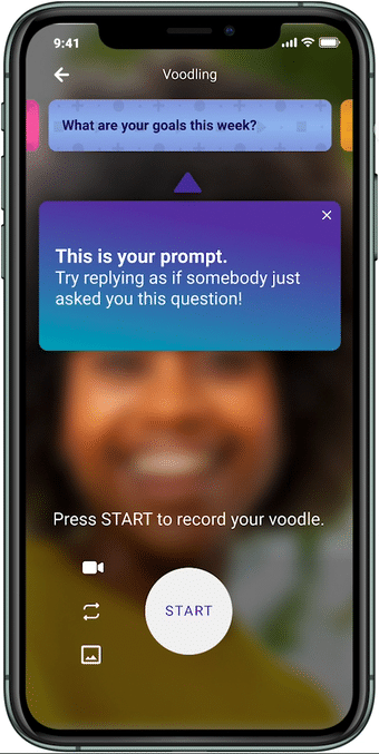
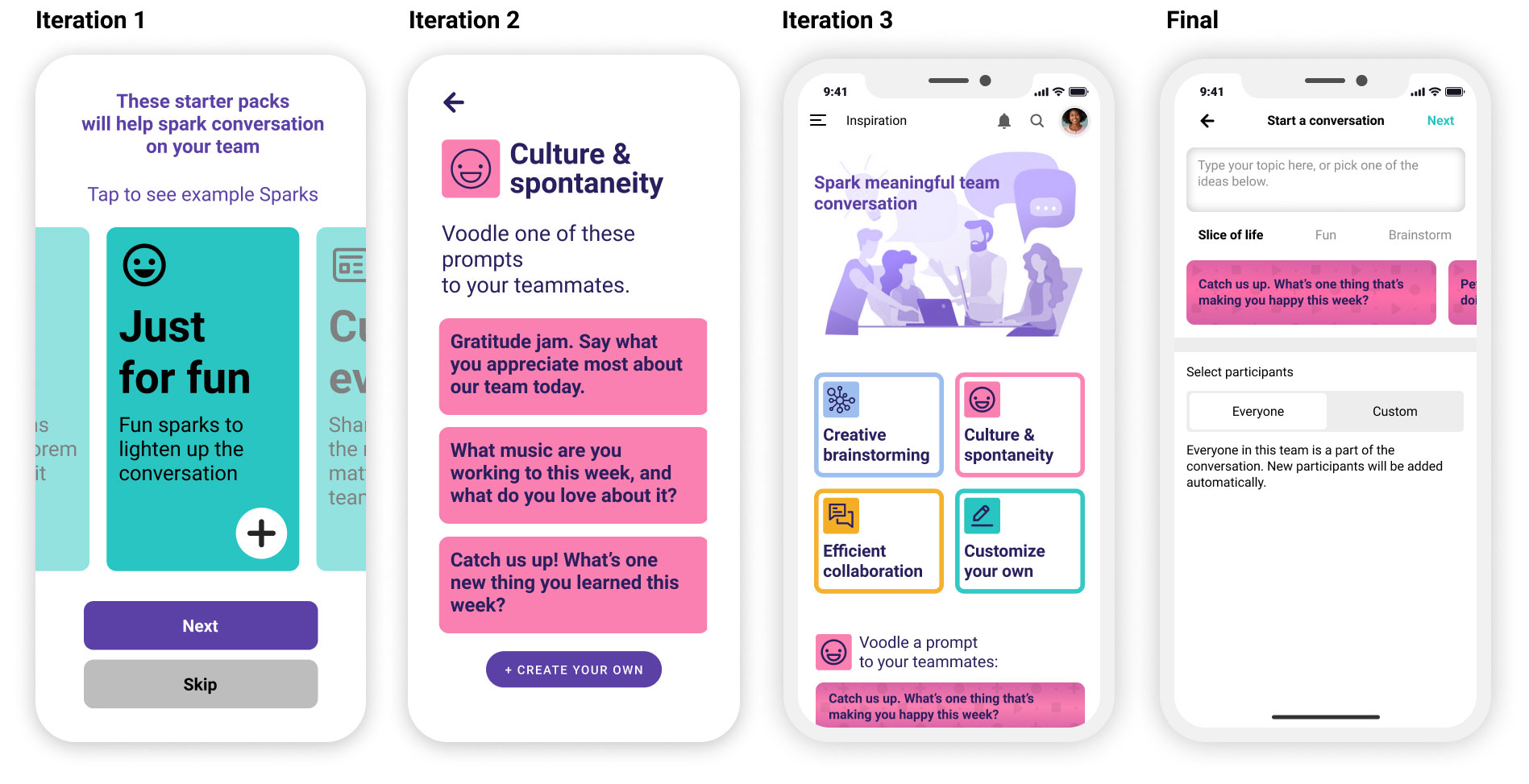
Prompts began as a way to assess opportunity areas in early prototype iterations. As users made choices during prototype testing, we learned what kinds of conversations were most intriguing for early exploration. We also learned something unexpected: Users liked the prompts themselves. Rather than feeling constrained or annoyed by conversation suggestions, they appreciated having more structure while recording videos.
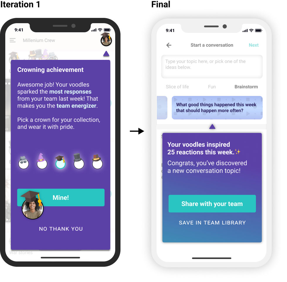
We experimented with different motivators during user research; including notifications, audience engagement, and gamification.
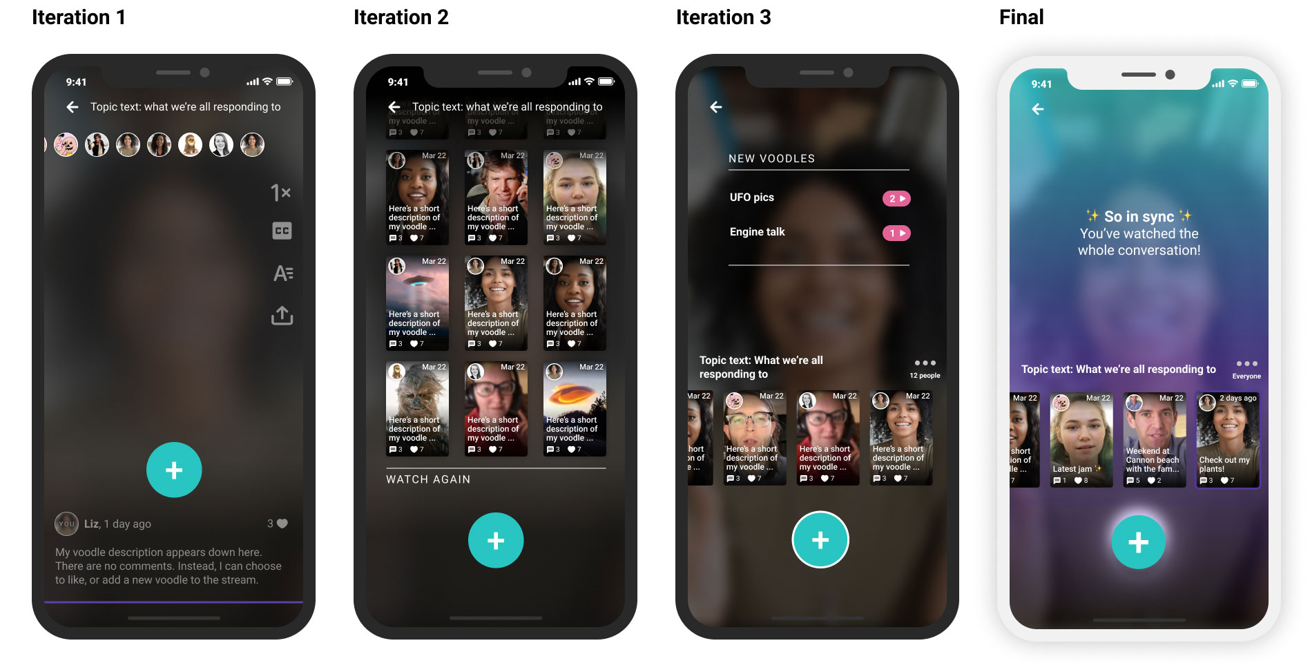
We improved the reply experience while watching videos - lowering the friction of joining a conversation. When we began our work, users had to tap back to their team homescreen in order to create a new voodle. I experimented with different ways to bring a reply button into the play experience.
More projects