Guggenheim
Near Me
Three-year project
Two major design updates
Ongoing testing and iteration
Digital Media Manager
Experience designer
Guggenheim Digital Media team
Acoustiguide engineering team
I identified opportunities for improving app UX as my team began a design process to leverage iBeacon technology.
I worked on shaping experience , on-site testing, and designing around spatial issues.
Visitors loved Near Me . The feature had a lasting impact on how we thought about app design and UX process.
I joined the Guggenheim Museum's digital media team in 2014, one year after the app first launched. The question on the table was:
Asessing the visitor experience and iterating design became the center of my job.
Together with my supervisior Naomi Leibowitz, I managed the app's content, deployment, QA, and design. We collaborated with our off-site design/dev team at Acoustiguide Interactive. |
I led implementation and analysis of better feedback systems for the design team -- including visitor interviews, on-site testing, quantitative analytics, and insight reporting. |
We designed the Near Me feature - a single screen that automatically surfaced information about nearby artworks as people walked through the museum.
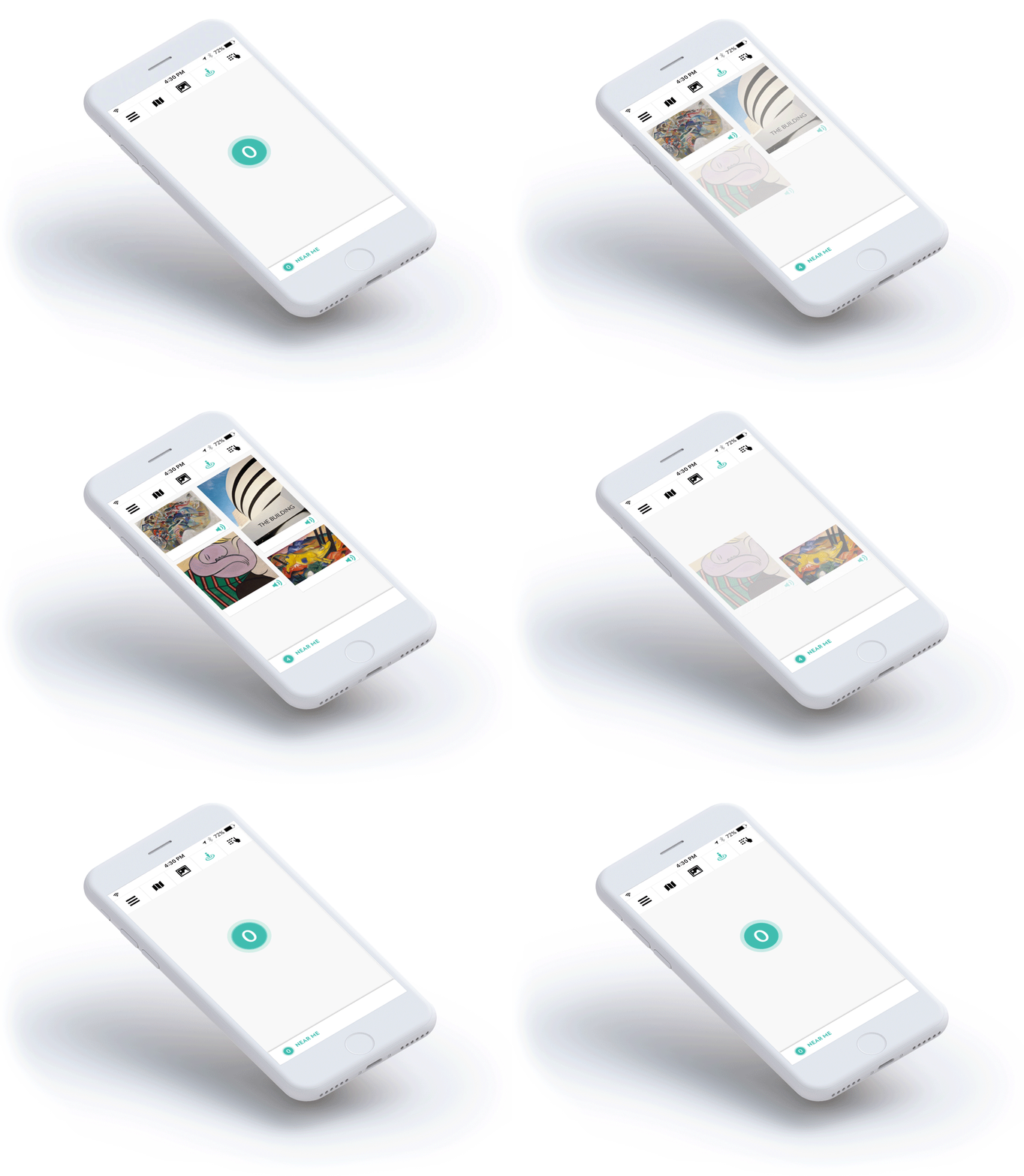
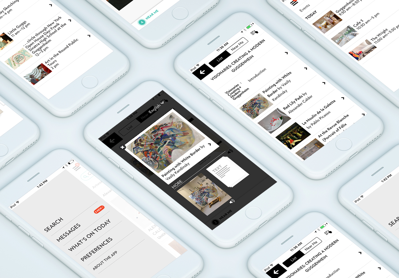
I identified three usability problems: |
|
|
|
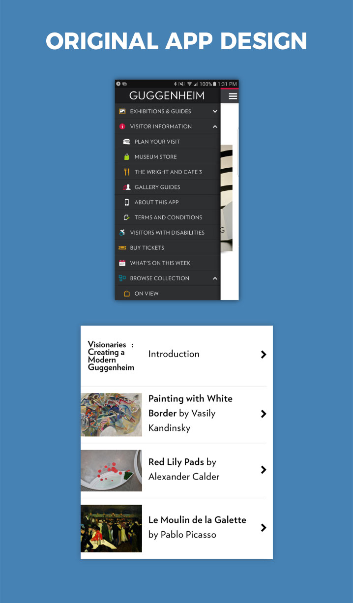
|
This opened design opportunities: |
|
|
|
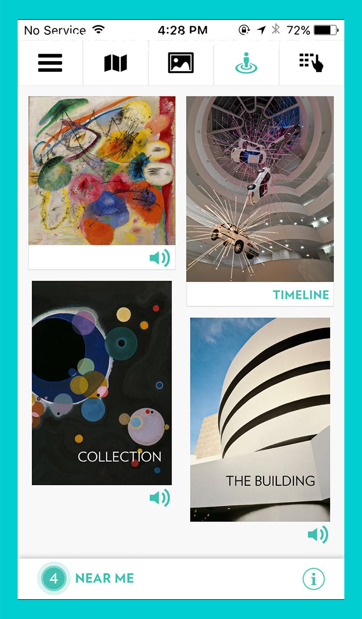
|
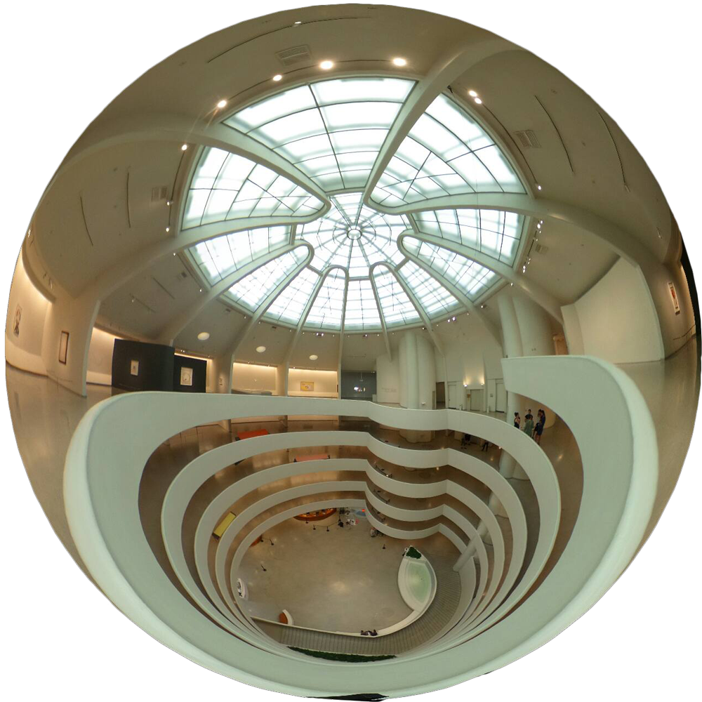
Unique space
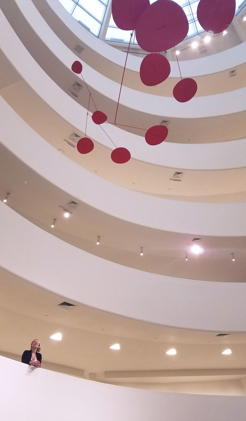
The Guggenheim Museum is built around Frank Lloyd Wright's iconic rotunda; a seven-story spiral topped by a glass atrium.
More traditional side galleries branch off the rotunda at different levels.
Implementing iBeacon technology in this environment was a challenge.
We needed content flexibility, but infrastructure stability
I installed iBeacons evenly throughout the museum, blanketing the space. This meant that devices could stay put while artworks changed position. It also gave me the freedom to experiment with different content configurations on the fly during beta.
iBeacons needed to be hidden from sight
I installed, adjusted, and tracked over 100 iBeacons in hidden locations around the museum.
Here's one under a bench...
Signal problems
The rotunda space distorted iBeacon signals in unanticipated ways. Different architectural materials blocked or extended signal ranges beyond what iBeacon settings could control.
Signals bled through some walls and bounced off of others. The glass atrium at the top of the museum reflected signals all the way across the rotunda.
This made it impossible to design an intuitive experience. My team lead was considering cancelling the iBeacon feature.
Signal solutions
I proposed a system to virtually "block" one beacon's content when the signal from another was detected. The developers built this customization into our CMS, and it gave me the ability to reshape when iBeacon signals would surface in the app, regardless of their full ranges.
iBeacon blocking gave us the flexibility to create a spatially accurate experience in the museum. We could artificially adjust the appearance of ranges to create realistic content mappings.
Principles for intuitive spatial design
I was responsible for the pacing and wayfinding of the on-site experience. I developed the guidelines for a consistently intuitive experience across all galleries:
Line of sight / If visitors had the visceral feeling of seeing an artwork, it should appear on the Near Me screen. Depending on ceiling height and pillar crowding, this feeling changed from gallery to gallery. Rather than basing signal ranges on distance, I based them on visitor behavior patterns.
Content blanketing / Visitors needed to trust the Near Me feature early in their visit. I found ways to map exhibition content to every space in the museum, including the cafe and stairwells. Ubiquitous content gave visitors consistent feedback that Near Me was working.
QA on the ramps
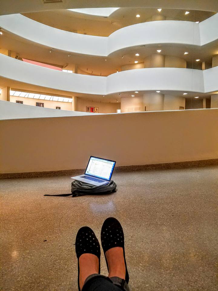
Remote coordination with our development team was a challenge. I was responsible for walking the ramps, testing our experience on multiple mobile devices, and finding effective ways to commnicate the results back to the team.
The techniques that I began to use for myself during this time helped me update our user testing methods.
Mobile usability testing
I had created a mobile QA form to record the time and location of any bug or note that I made on the ramps. Later, during beta testing, we incorporated this form with the app.
Visitors sat down with me for a usability test and exit interview, but also provided feedback as they walked through the museum.

“ |
I just loved it, and Near Me
|
We first soft-launched Near Me as an optional navigation screen, maintaining the app's more traditional list interfaces.
Near Me became the main point of contact with app content. Visitors loved the simplicity of the interface.
“ |
I really liked the Near Me button, it made it super easy to find works I wanted to learn more about.— Museum visitor |
Staff found it easy to explain the app by directing visitors to a single screen.
“ |
Enjoyed myself today. I liked learning the new technology on the multimedia guide. The guide is advanced but well done.— Museum visitor |
The technology behind Near Me was novel enough to interest tech-forward visitors, but intuitive enough to disappear into the background and service the museum experience.
The Near Me feature was nominated for a Webby Award for its use of location-aware technology.
It changed the way we thought about museum visits , shifting our focus from a top-down design of exhibitions to the design of a single person's journey.
Other museums adopted our design principles as their own. I advised the Warhol Museum and the Frick Collection on iBeacon blocking, content deployment, and other factors that supported the feature's success.
But the most important measure of success came from our visitors ...
“ |
This is the best multimedia guide I've ever used. I've used them in museums all over the world and this was the most user friendly. |
— Museum visitor |
Ongoing user research
Over the next two years, I continued to improve our user research techniques, beginning regular testing with visitors in the museum lobby.
I also planned the implementation of Google Analytics tagging for the new feature, identifying which data points would give us actionable information about the visitor experience.
Changing my direction
I loved working in the user experience design field. It brought storytelling and technical experimentation beyond art spaces, into the everyday world — artistic and deeply practical at the same time.
I wanted to work more closely with people's lived experiences. I applied for the Masters in Human Computer Interaction + Design at the University of Washington, and moved to Seattle.
Goodbye Guggenheim ♥
More projects

