with prototypes & objects
| Sarah Outhwaite · March 21 2018 |
I kept thinking about worldbuilding during our winter Prototyping Studio.
CS professors Jon Froehlich and Jen Mankoff took us through a three-month fabrication intensive, introducing one method after another on a weekly basis. (Only our final team project extended to a full two weeks. You can read about that prototype here.)
Every build technique developed a central object with the goal of exploring a related, contextual world. As UX designers, that world is what interested us. We prototyped to engage the blind-spot infill of human imagination. How would users behave while interacting with this object? What context would they create for it?
Here are my favorite one-week prototypes from winter quarter:
Melo rideshare | video prototyping
EcoAngel shower | model prototyping
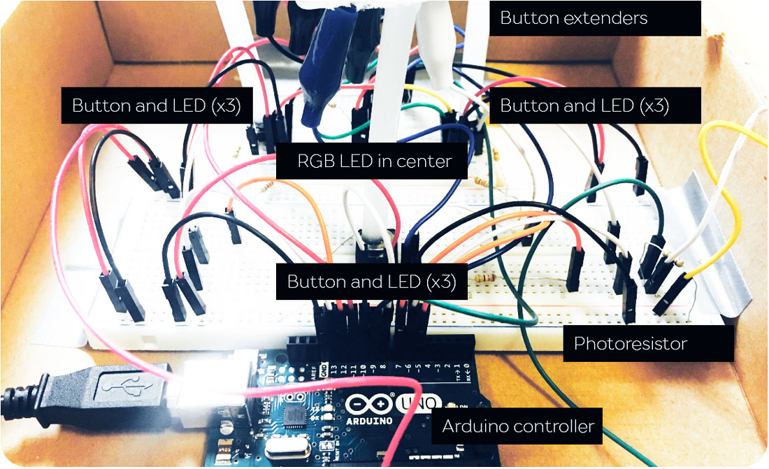
Arduino case | 3D printing
for remote touch
| Sarah Outhwaite · Jan 12 2018 |
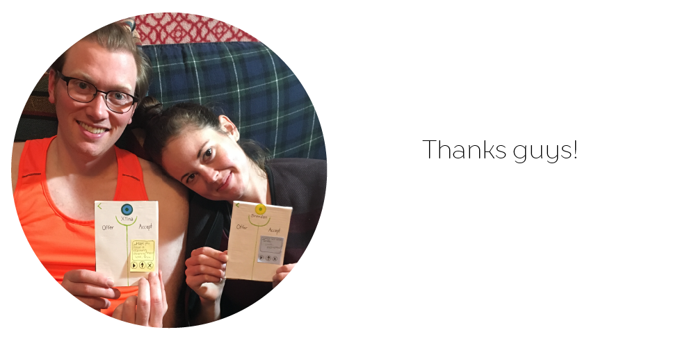
I'm fascinated by long-distance touch, so I was thrilled by our first Prototying Studio assignment; build a wearable experience inspired by physical contact and consent. Make everything out of paper.
How do you test an experience as complex as haptic touch—on a short timeframe, with no budget? You can identify the emotional high points of the interaction, and scrap together an interface that allows users to imagintively access these moments. If the rest of the interface is unpolished—no worries. Further rounds of design will follow.
"Say it's only a paper moon
—Ella Fitzgerald & co
sailing over a cardboard sea
but it wouldn't be make believe
if you believed in me..."
I had one week to design and test. Here's what I built:
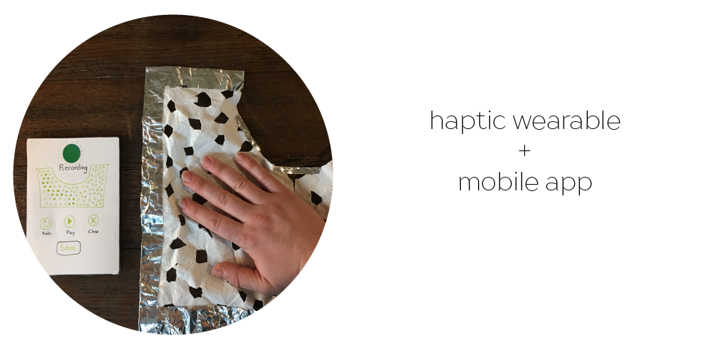
Reach Out is a haptic wearable paired with a mobile app that records and transmits pressure and warmth. Couples can use this interface to exchange discrete, lifelike virtual touch with each other while physically apart.
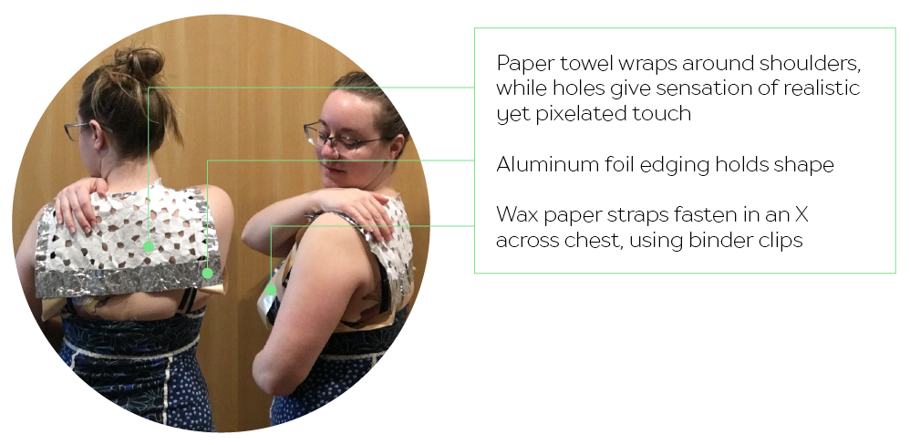
The wearable sits on the upper back and shoulders, and can be worn directly against the body beneath clothing. It only records touch when activated by the app. Dots on the mobile screen provide visual feedback as touch is recorded. Couples can send written messages with each touch, and save, replay, or delete touch messages at their convenience.
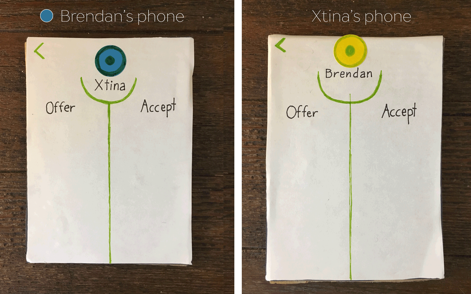
The sharing sequence models good consensual touch practices, and emphasizes the importance of mutual consent even within long term intimate relationships. Partners decide if and when they want to accept each touch.
I tested Reach Out with a real-life couple. They onboarded together, discussing a scenario in which they’d use the app in their own lives. Then they put on the wearables, and took turns offering and accepting touch from different rooms. When “recorded” touch was “played” back, the sender stood behind the recipient to recreate “recorded” motions.
LEARNINGS
This is all very rough, and that's what I like about it. We're replacing "no" with "yes" in the decision making process. Could this work? No...but yes, maybe this one part could work, let's find out immediately. Why wait?
Let's get a prototype in people's hands and let them be our teachers. "Make believe" becomes real discovery with just a little bit of paper as a reference.
Based on testing, next steps for Reach Out could include a "live" or simultaneous mode, a wearable that extends over the chest, and padding in time to test the complex implications of building and saving a private touch library.
Next steps for me? I'm looking forward to finding out. This is just Week One of Prototyping Studio. There's a lot to build before the quarter's over. (-:
Or, how I learned to stopy worrying
and love critical design
| Sarah Outhwaite · Jan 07 2018 |
Hi 2018. Look, no pressure. I know you’ve just arrived, but I’m counting on you. See, your predecessor shook up my progressive values. Rather than feeling their guidance, it now feel like I’m guiding them.
Ah yes, that’s right, 2018 – we’re not counting on you. You’re counting on us.

I’ve been a grad student for just over three months now at MHCI+D, and I’m starting 2018 with a strong undercurrent of hope and energy. MHCI+D is all about turning problems into questions, and challenges into opportunities. Not only has the program immersed me in rewarding collaborations. It’s also got me rethinking the role that a designer can play in a difficult world. Here’s how that happened…
THE PROBLEM SPACE
“In the early days the Nokia HCI people were told ‘Please evaluate our user interface and make it easy to use.’ ... And now, the engineers are pleading with us: ‘Look at this area of life and find us something interesting!’”
—Liam Bannon. Reimagining HCI: Toward a More Human-Centered Perspective.
We practice defining the problem space at MHCI+D. All studio projects begin with an exploration of real-world scenarios in which we can execute meaningful, human-centered design.
During the fall quarter, I worked on projects that began with open-ended briefs. For example, in my Studio course, we were challenged to design a viable product for tomorrow’s “smart cities” without further specification. Similarly, in my design research elective, we were asked to define a problem space that could be addressed through computer vision.
The resulting project surprised me in unexpected ways, and reshaped my understanding of design.
FOOD FOR THOUGHT
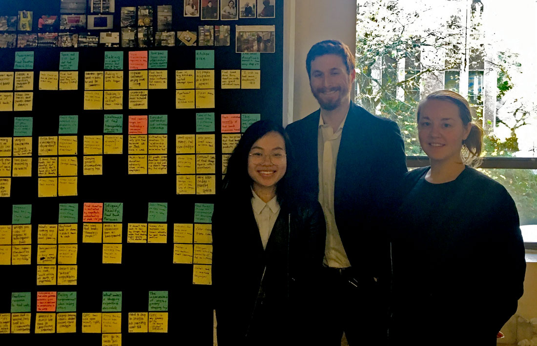
My elective team included two great designers: Jen Vuong (Interaction), and Ryan Gilmore (Industrial). I represented the UX perspective. Together, we considered the strengths of computer vision technology, and looked for industries that would benefit from enhanced visual monitoring.
We landed on the food industry, focusing on the consumer experience. Perishable food requires tight cycles of distribution and consumption, and benefits from automated oversight. Yet few design solutions have reached people’s personal kitchens. How might we use sensor technology to help improve food distribution and reduce food waste, starting at the individual level?
PROBLEM SOLVED
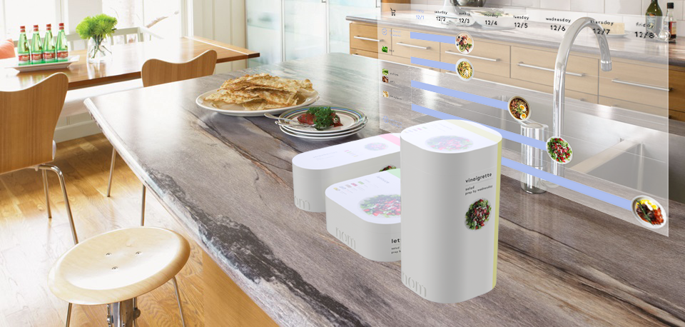
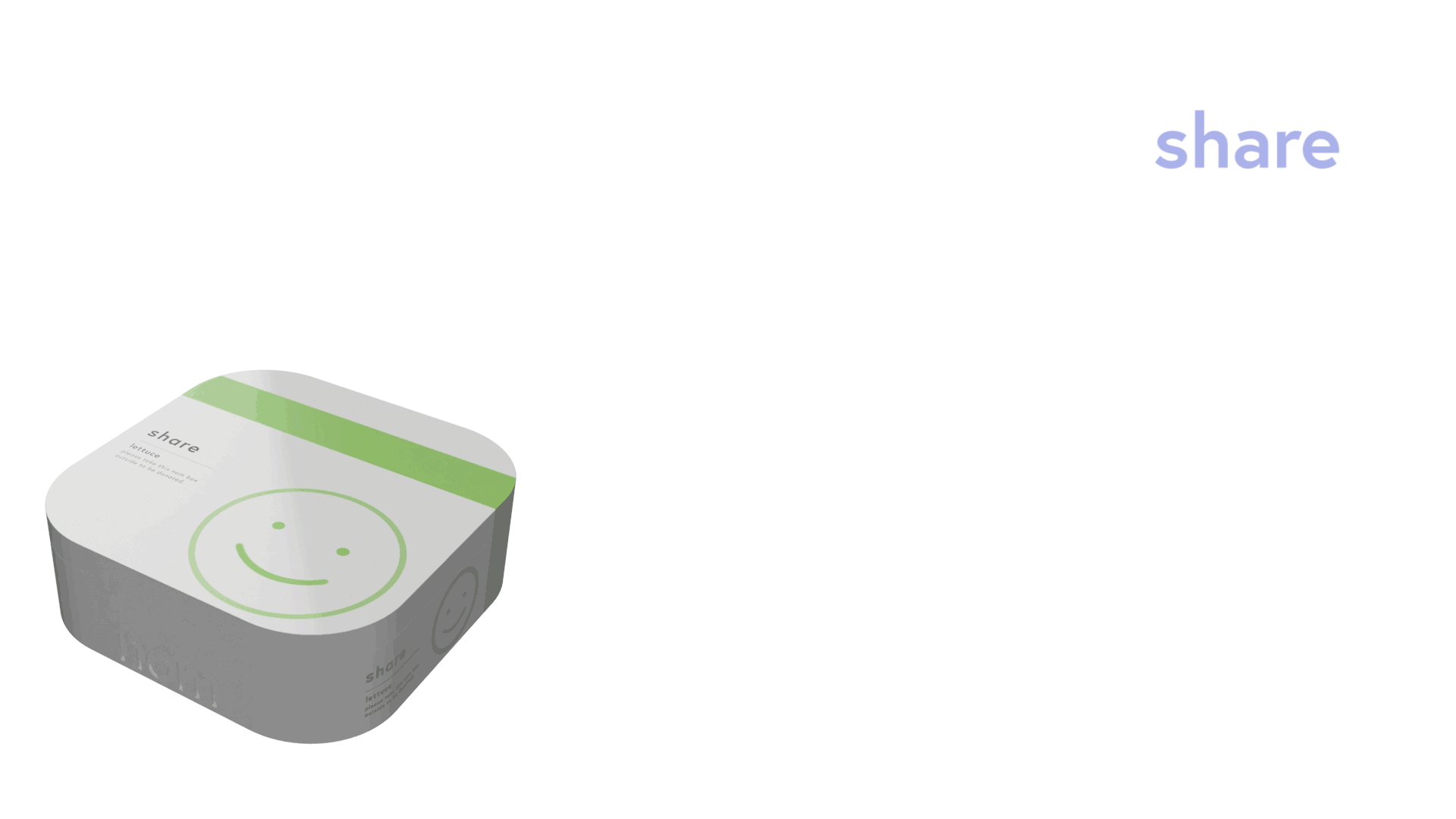
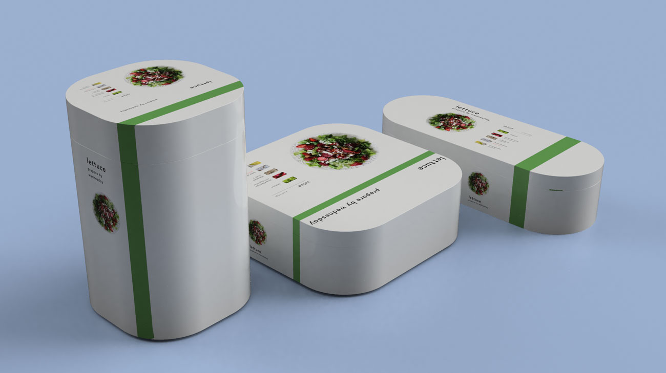
Meet nom – the perfect future for personal food management. nom is the “complete home food system,” a solution for reducing food waste based on computer-vision tracking and automated meal planning.
This system rests on a computer-vision enabled box that re-conceives the relationship between food packaging, storage, and disposal. The nom box dynamically tracks whatever perishable contents it holds, as it cycles through different ownerships.
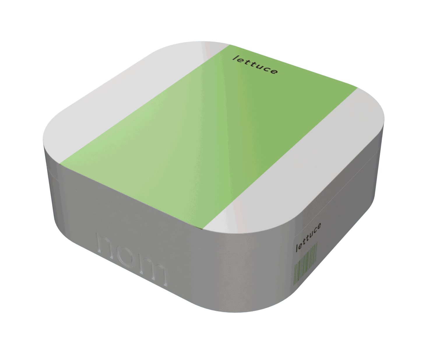
Pick a nom box up at the store, bring it home, prepare food, store leftovers, and eventually dispose of the whole thing by placing it outside your door for seamless pickup. Dynamic vision “sees” and analyze food content, updating exterior displays to indicate ingredients, freshness, and possible recipes.
Once you put a nom box out for disposal, the system automatically runs a quality analysis to flags its contents for compost, landfill, or donation. This takes the logistics of ethical disposal out of individual hands. In fact, nom consolidates all of the decisions required for an ethical food practice in the moment of purchase.
TWIST
But nom is not sincere. It’s a critical design, which interrogates the idea of food subscription services. We wanted to interrogate the idea of food subscription services, and highlight their paralyzing effect on local food ecosystems. We created nom to highlight the isolating effects of buying into personal convenience without investing in social relationships and varied perspectives. nom apparently provides food choice, awareness, and education, but actually makes participants dependant on a single food resource.
How did we move from a sincere problem space to satirical design?
THE FOOD BANK
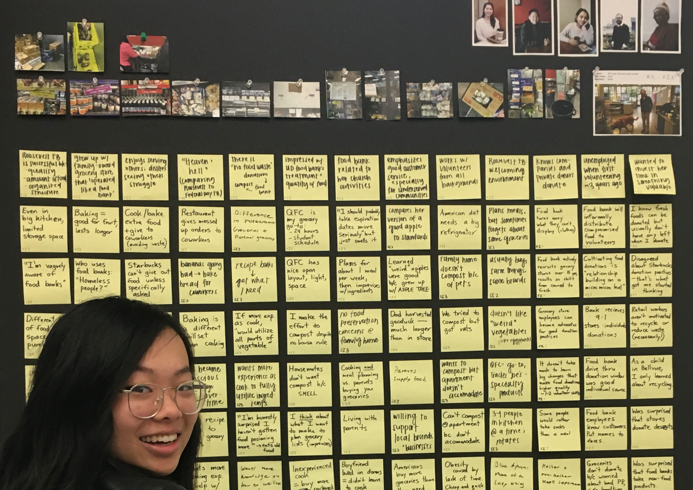
My team conducted design research at a local Seattle food bank over a three-month period. We used techniques including interviews, card sorting, and field studies to model the logistics, needs, and personas of a successful food donation community. Not only did this food bank demonstrate effective practices in seeking and recruiting food donations – it also showed us the importance of food storage and resource rotation for minimum-waste systems.
Key points that determined successful resource management included:
The J.I.T. or “just in time” system: The food bank keeps its on-site storage low, and regularly cycles through all of its stock. This reduces storage expense and supports the commitment to provide a healthy variety of fresh and rotating food types.
Interpersonal relationships: Food distribution requires careful handling. Donors need to have a certain level of awareness and willingness to put effort into preserving food quality, or their donations will end up unusable. As the food bank director told us, “There’s a difference between corporate policy and actually caring about the donations…It’s relationship building on a micro, micro level.”
Trust: Food source trust is critical to sharing and consuming. Food bank customers trust the staff’s ability to vet edible food, even when it’s past its sell-by-date.
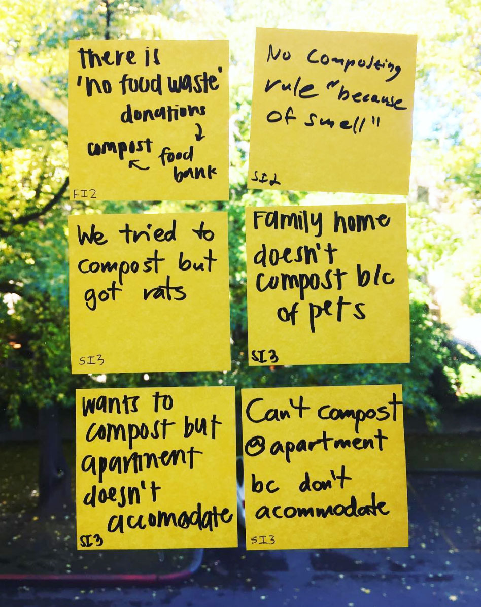
We then interviewed local university students, screening for people who valued food sustainability but lacked an awareness of local food donation options. From these interviews, we noticed a trend of frustration. Busy students expressed feelings of wastefulness and irresponsibility when they failed to prepare ingredients that they’d purchased, complicating their enthusiasm for sustainable shopping and eating. They discussed food subscriptions services like Imperfect Produce and Blue Apron, and reported partial satisfaction.
In contrast, food bank volunteers expressed feelings of pride and fulfillment when they donated or gifted their extra food. Theirs was a broader definition of food “normality,” and they benefited from understanding which un-ideal foods remained healthy to eat. Most importantly, volunteers passed on their positive social reinforcement by becoming recruiters for better sustainable food practices. They motivated friends and family to engage in better food practices.
We wanted to harness this energy, and generate a ground-up enthusiasm for sustainable food communities through increased social relationships and awareness.
IS CONVENIENCE OUR FRIEND?
We were on our way to creating an awareness campaign for food donation at the local level. Using computer vision, we’d help the food bank monitor and collect individual donations from neighborhood dropboxes – or some similar solution. The desire for personal food education would motivate opt-in.
But we kept coming back to our data, and stumbling against the issue of convenience. The students we’d spoken with were unlikely to undertake extra effort as a matter of personal benefit. They preferred to save time, and invest money in food service subscriptions.
As designers, we couldn't shut our eyes to human nature. We embraced this tension, and designed the logical extension of a system that prioritized personal convenience and resource efficiency above all other factors.
This is how we came to our final solution: the nom box. By handing full control of food selection, sharing, and meal planning over to computer-vision enabled boxes, future populations could minimize waste and maximize personal convenience without needing to engage in human relationships.
We picked cool tones and deceptively friendly styling for our branding, leaning in to the blank crispness of minimalist packaging design. I built our animated product video, eschewing any representations of human interaction for product-focused motion graphics. Welcome to the convenience-focused future!
Convenience is indeed a designer's friend. The nom project wasn't a blue-sky fiction. Our teacher Michael Smith pointed out that the design became an effective present-day awareness campaign because it grazed real-world solutions for personal food management. Grounded in user needs, it engaged familiar territory for its audience; supporting a self-guided examination of personal choices.
I learned an enormous amount about perishable resource management through this project. Automatic calibration, measurement, and management are powerful tools that should continue be made increasingly available on a personal level. What's dystopian about nom is the totality of the system – a system from which you never emerge.
DESIGN WHAT WON'T BE
This project woke me to the possibilities of design as rhetoric, and how it can be used to scope the extremities of social value and danger. Critical design highlights the world dynamics that design must move through, rather than sidestep around. It keeps us sensitive to the thin lines between helpful and creepy; convenient and inhumane.
My first three months at MHCI+D have been deeply colored by the growing national mistrust of political and technical systems. Yet I head to the studio every day with students and teachers who confront complications with incredible insight, skill, and fortitude. Design continues to surprise me with its variety of tools and techniques for sustained, adaptive response to the world. It gives the means to support my values in the coming year.
Visualizing a job history dataset
| Sarah Outhwaite · september 15 2017 |
| originally published on MCN.edu |
A #musetech job has never been an easy thing to find. They only emerge when enough institutional pressure builds up to break the surface.
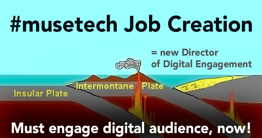
The Job Description History Project team spent this summer hunting not for one museum technology job, but for hundreds. By scraping historic records, we aim to understand the evolution of these positions over time. You can learn more about our process from Desi Gonzalez’s inaugural project post.
Our team has pulled together several collections of job titles and descriptions. But mining data is always a messy affair. The datasets we’ve amassed each have their own special inconsistencies. Sample sizes and source types fluctuate. There are conspicuous holes within the 50-year timespan. As we begin to plot these varied findings in relation to each other, how do we analyze data that defies easy comparison?
I’ll take poetic license to describe the first of several datasets that we’re analyzing for this project as “a sample of MCN-affiliated job titles.” Job titles before 2016 were drawn from the Museum Computer Network’s official archives at the Smithsonian Institution Archives. Team member Nicole Riesenberger dug into these resources and recorded job titles that were relevant to museum technology. Her sources included the journal Spectra (published from the mid-1970s to 2002), membership directories, conference speaker and attendee lists, and publications. Data from 2016 had a different source, as we were able to snag all job titles from MCN2016 conference attendees. (Consequently, 2016 boasts over ten times more job titles than any earlier year.)
This data is not a complete sample—it’s a group of islands in an ocean of missing information. We can’t directly compare our findings from one year to the next. I grappled with this uneven distribution by focusing on the moments when #musetech terminology broke the surface and appeared in job titles. First, I crunched all job titles down into individual vocabulary terms (like collection, technology, and information). Next, I charted the emergence and disappearance of these terms throughout time. In what year did web first pop up in one of these job titles? Which terms were brand new in 2016, and which disappeared after the 1990s?
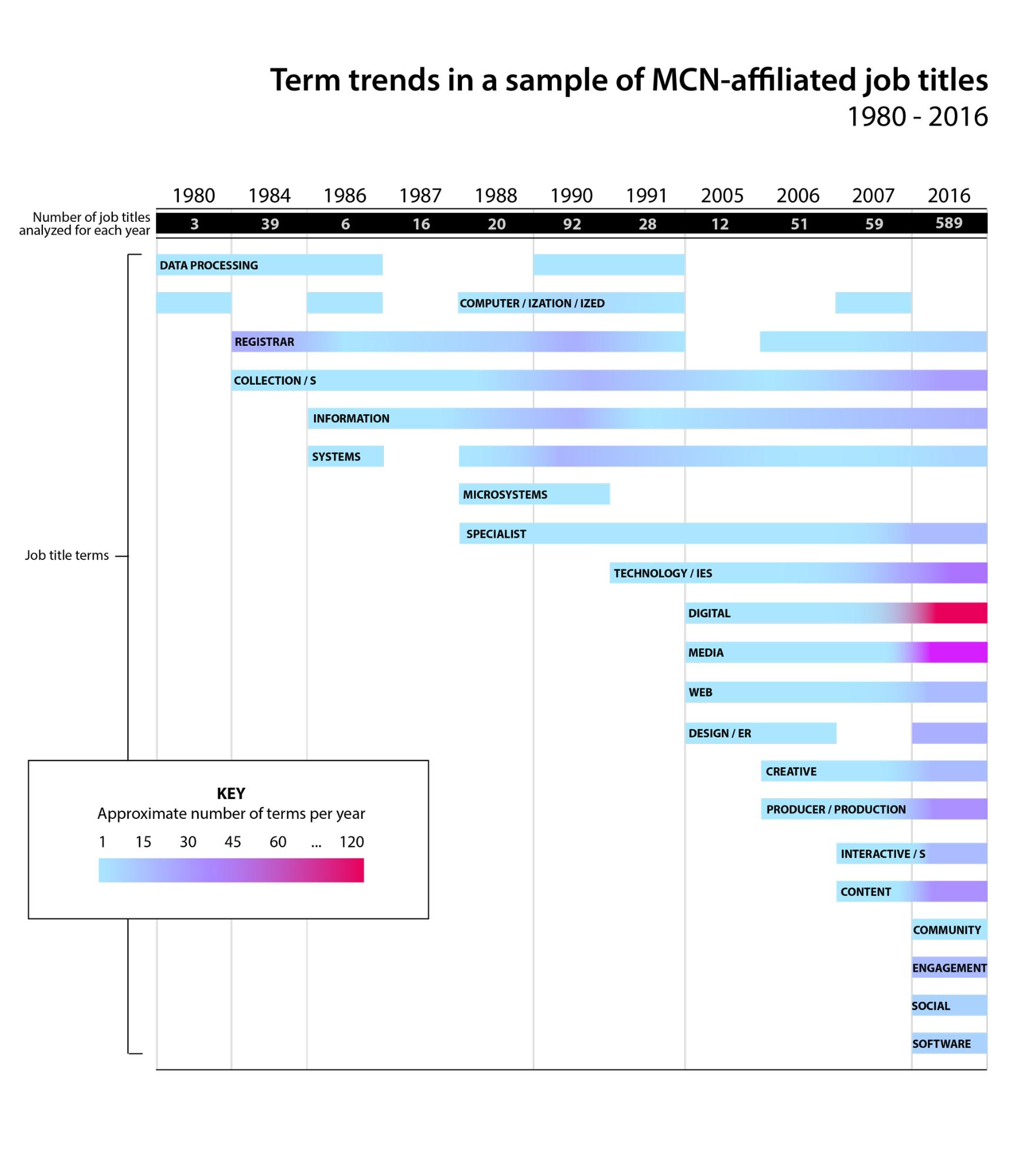
For this chart, I selected a handful of the terms that shed light on trend shifts in the museum technology field. In order to be included, terms had to emerge or disappear from the dataset; they couldn’t appear in every year. Terms also needed to trend up or down over time, relative to the total number of titles analyzed on given years.
For example, the terms registrar and specialist featured contrasting trends. In 1984, fifteen out of 39 job titles included the term registrar; but only five of 589 would do so by 2016. The term specialist didn’t break the surface until 1988; yet it appeared in twenty-three job titles by 2016. Taken as statistics, these trends don’t hold water—but they do map the outlines of a story. I like to imagine the pioneering registrars of 1984 gathering new technical savvy for their institutions. These enterprising tech generalists would have paved the way for the tech specialists of 2016.
The chart also shows how job title terminology shifted toward media, content, and the creative or production process over the last twenty years. Terms like community, engagement, and social were introduced in the last ten.
More patterns begin to suggest themselves. Data processing in the ‘80s led to effective information systems in the ‘90s. Web exploration in the ‘00s set the stage for digital content expertise. The recent explosion of social media gave museums the tools to connect with individual audience members, and supported the even more recent rise of user experience as an expertise.
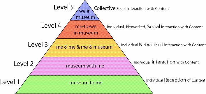
The further that GLAMs specialize in applications of technology, the more we’ve trended toward audience outreach. In her 2007 blog post Hierarchy of Social Participation, Nina Simon described “collective social action with content” as the highest level of museum experience design. Many of today’s freshest #musetech roles serve this goal. From networking objects, we’ve expanded to networking humans.
What #musetech will the generalists of 2017 build into new institutional expertise? Could today’s focus on digital wayfinding and building experience lead to future job titles like Visit Personalization Specialist or Gallery Intelligence Coordinator?
But even as new technology roles emerge, there are some baselines we can count on. Consider the Computerization Coordinator who went to the MCN conference in 1980, and the Digitization Coordinator who went in 2016. Museums will always need staff to convert objects into data.
At least—until the objects get smart enough to catalogue themselves.